User Experience in VR
My experiences in VR development
What I learned from VR game development
- Player experience design
- VR game development
- QA testing and evaluation
10 Usability Heuristics should be carefully evaluated
Ever felt lost in a VR game? I certainly have. More than once have I started the VR experience standing in a dark room or some fancy sci-fi space, looking around and still not a clue of what to do.
When users move from 2D screens to 3D immersives, the interface is no longer familiar to them. Since VR is still a relatively new medium, there are less conventions in user experience design across applications. Luckily, the 10 Usability Heuristics can still applied here and I found them to be highly valuable when developing the VR game during my internship.
Visibility of System Status
VR doesn’t have a standard of way of displaying system status, like breadcrumbs in web design or tab bars in mobile app design. There’s no “status bar” to place information in a 3D world.
I found this problem when I first play-tested our VR game. Before each round begins, there is a 24 seconds voting period where the player is waiting for the Twitch audience to vote on level difficulty. There is no countdown clock or any other method to show the progress, leaving the player confused and sometimes bored. This is caused by not displaying the current system status.
I explored different ways to solve this problem and ended up using audio prompts. Since our game already have a “virtual host” that guides the player through the game and makes random commentaries, we decided to go with the same theme. We asked the voice actor of the “virtual host” to record some short audio clips explaining the current voting status to the player. In addition to informing the player that audience is voting on the upcoming level, the host will also entertain the player by commenting on the voting process.
User Control and Freedom
There isn’t a convenient place to put the “X” Exit button in VR, nor a Back button. In many VR applications, once you’ve selected an option, you just had to go with it or restart the experience.
When play-testing our VR game, I noticed that there is no way to exit out of the game or to open up the main menu. Both the trigger and the trackpad button on Vive controller is occupied by game controls, so there is no where else to put the main menu button.
After discussing with the designer aout this issue, we decided to keep the way it is, since “this game is basically to troll you.” However, we added an audio prompt to inform players that they can return to main menu by “killing themselves in the game.”
Error Prevention
In my own experience, the precision of “pull trigger to select” on the controller is lower than “click to select” using a mouse on a computer screen. Sometimes when my controller is pointing at one option, after I pull the trigger causing a slight muscle movement, my controller is shifted downwards and I ended up selecting the option underneath it.
A common way of solving this issue in VR is to change the action from clicking to holding/hovering for a short period of time. This eliminates most error-prone conditions such that the player is simply looking around or grabbing the virtual objects around them. This is implemented in our game: when the players want to identify the save tile, they need to hold the trackpad button for 3 seconds to confirm.
Other Usability Heuristics
The above three usability heuristics are the ones that I found the most useful when evaluating the user experience in VR. Other heuristics are applicable to VR as well, such as "Aesthetic and minimalist design" which is even more important in VR than 2D design space, since the virtual space can feel cluttered real quick as more information are added.
User Interface in VR
Summary of Effective User Interfaces for VR
VR user interface is still pretty much a blank canvas waiting to be explored. Some VR applications basically move UI for 2D screens into VR; some others might have traditional interfaces such as keyboard in the the game, etc. The most common approaches right now is to use controllers as laser pointers and aim at a 2D UI to select, with additional track pad control for scrolling through pages.
Through researching and playing VR applications, I found these solutions that are well designed and very effective for VR.
3D UI
Instead of aiming with a laser and pressing the trigger button to interact with UI, make 2D UI into 3D objects so that the user can directly interact with it. 3D objects also blend in with the virtual environment better.
- Buttons with depth and thickness feels more immersive
- Clicking buttons on controller → pressing physical buttons in VR
More examples:
 Spinning wheel in Potel (VR Pottery Simulator) is controlled by physically pushing in the wooden buttons
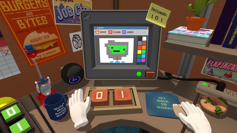 "0" and "1" keyboard in Job Simulator. Joey Davidson, technobuffalo.com
Physical Interactions
Different than the previous solution, this one is more about changing the concept of what UI can be. Think out side of the box, use the physical world as inspirations. Here are some examples:
- Pick up a book to open the menu / touch the pages to go to different page
- Grab a ball that represents an option
- Piece things together to use
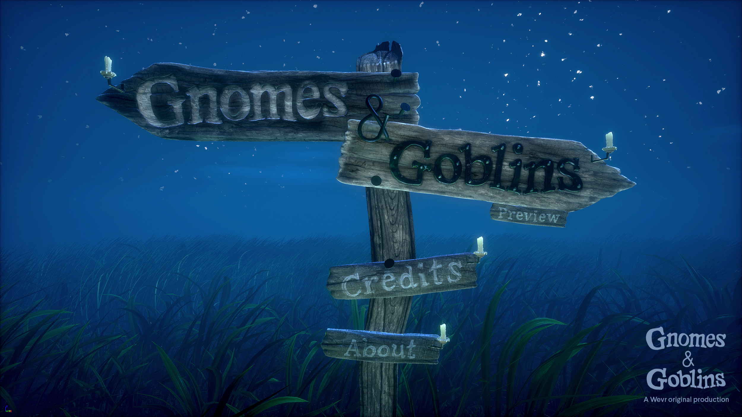 Light up candles to select different options: main menu in Gnomes & Goblins.
 Ian Hamilton, uploadvr.com
Extend Controllers
Let's move away from UIs, and focus on how we can modify our controller to make itself an interface. The best example would be the menu in Tilt Brush.
Tilt Brush, one of the controller becomes an interface. It's a cube with four faces displaying different menu options. The user can go through the menu, simply by rotating their wrist.
Michael Fischer. A Proposal For A Virtual Reality Museum For Virtual Reality Art. MW17Another way is modifying the controller's shape to extend its functionality. In Daydream Lab's prototype of the "Drum Keyboard", the controller becomes a drumstick that can collide with the drum keys. This way the user can type on the keyboard without their virtual fingers or the controller model blocking their view.
Daydream Labs: Drum Keys. Google AR & VR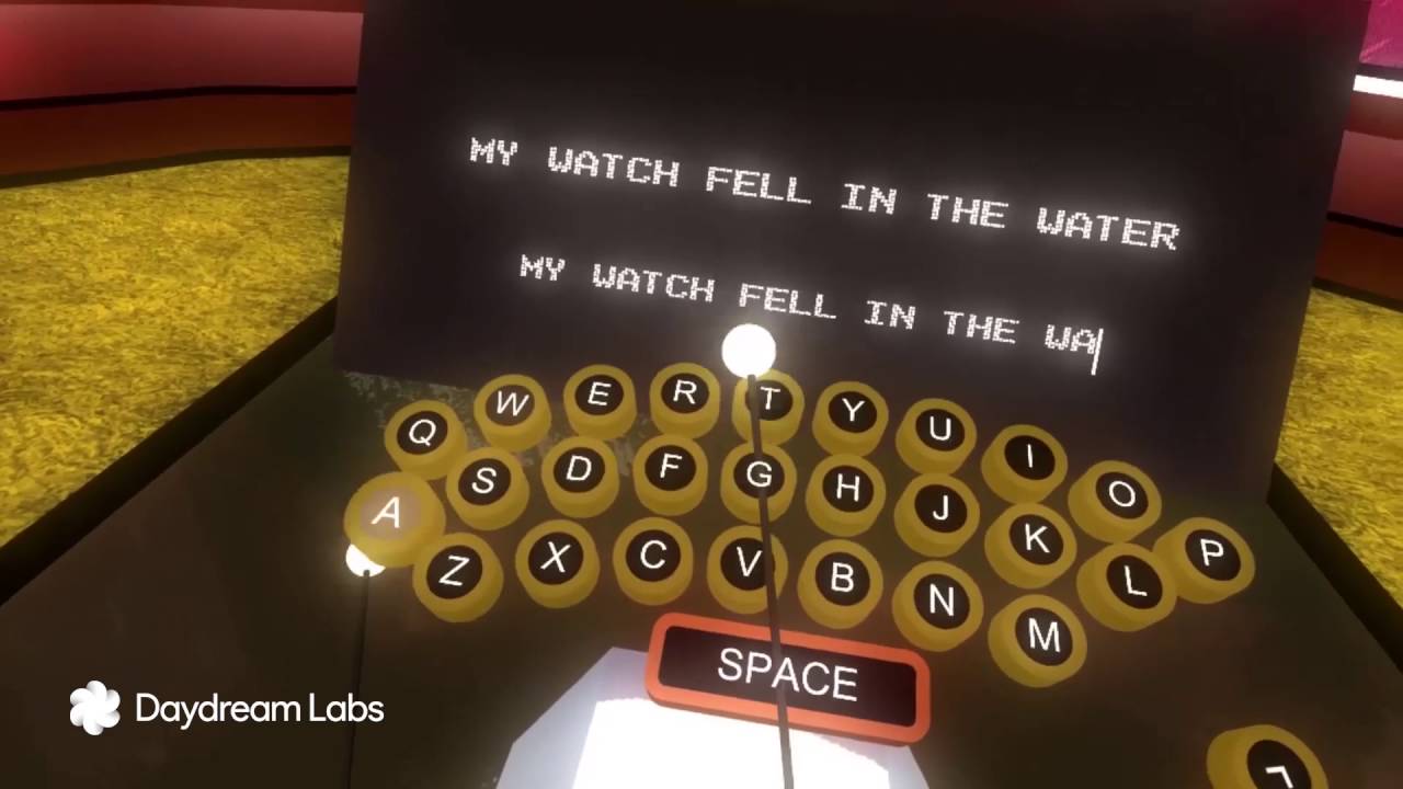
Gesture Interface
A universal, natural user interface would ease the learning curve of jumping into new VR applications and help more users to adopt VR. Thus I am proposing a generalized gesture-based interface that can be to guide user experiences design in VR.
You can read my Master's Project proposal here:
Designing of VR Gesture Interface
More Thoughts
Details are important
Unlike other mediums, the immersiveness of virtual reality gives users the most unique experience, but at the same time magnifies the tiniest glitches and inconsistencies. Your game could look perfectly fine in the Unity3D window, but once you put on that headset, the bugs become a lot noticeable simple because “it doesn’t feel right.”
During my development experience, I found that small problems within these areas tend to be ignored by our developers, which could make the game feels unfinished:
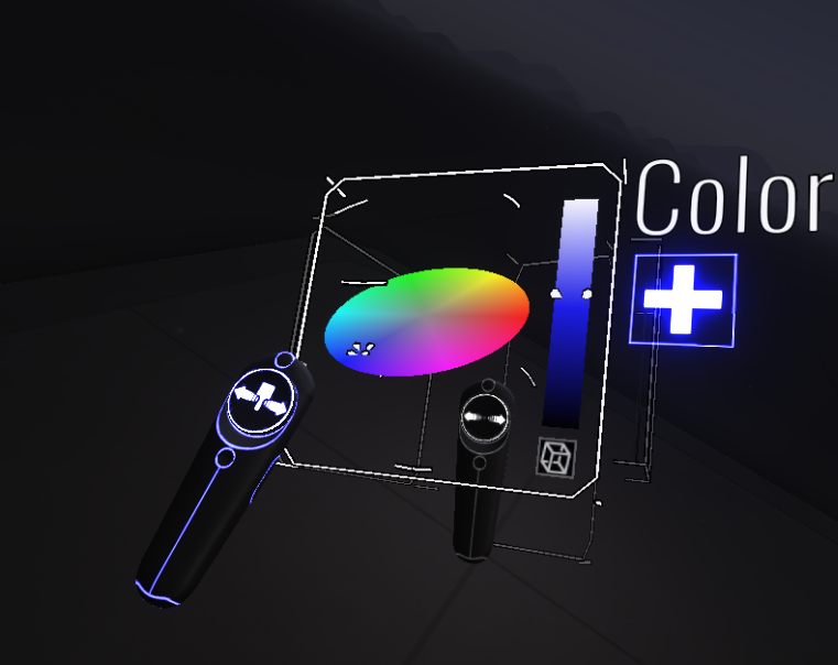
- Color inconsistency in 2D interface as well as 3D objects
- Changes in the peripheral vision
- Audio not syncing with visual
- Inconsistency in volume level
Another area that could potentially break the game is: throwing things in VR. It's no secret that players all love to throw random things around in VR, but it could cause hidden problems as well. Take the following problem I encoutered during VR game development as an example:
It is possible for players to throw batteries (the key to solve the puzzle) onto certain places where is unreachable by the player and get stuck. Since the batteries doesn't respawn unless they hit the bottom of the game board, that round becomes unsolvable. I used a simple solution without changing much in the game: make the surfaces slippery for the batteries, so they will not stay on those surfaces, and always fall along the sides and eventually get respawned.