VR Barista Training
Designing the User Experience of VR Job Training
VR Barista Training
A FutureX Project
Worked within the Future Experiences team as a Unity developer, I focused on improving the UI and modifying 3D assets to enhance the immersive experience.
- VR User Interface Design
- Built in Unity3D for HTC Vive Pro
Original User Interface
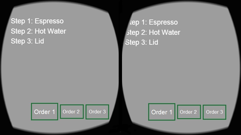
When I first come into the project, the UI was quite messy. Since the target platform of this application was Augmented Reality, the UI was originally designed to ensure that key information is always visible to the user. The list of steps and coffee orders is overlaid on top of the user's view as follows:

- The overlaid information is distracting to the user. Since the purpose of our application is training, we want the trainees to focus on the actual activity.
- Due to the hardware limitation, lens of the HTC Vive tend to get blurry around the edges. It causes the text at the top-left corner hard to see clearly.
- The UI would become unreadable if more items are added to the list of steps.
Therefore, I suggested that we should remove all overlaid information and display them elsewhere.
Re-design Orders Panel
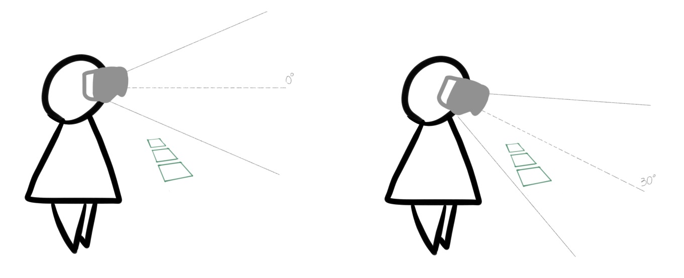
Order accuracy is one of the main requirement of this application. So we need a different location to put the orders. I proposed a solution: place the orders panel on an "invisible belt" that straps onto the user, so it moves along with the player and the player can review the orders simplyby looking downwards.

I made a quick prototype and moved the panel to the user's virtual body, with position and rotation relative to the user's headset (CameraRig). So the player can move and turn around freely, with the panel just slightly below their line of sight, but still within their peripheral vision.
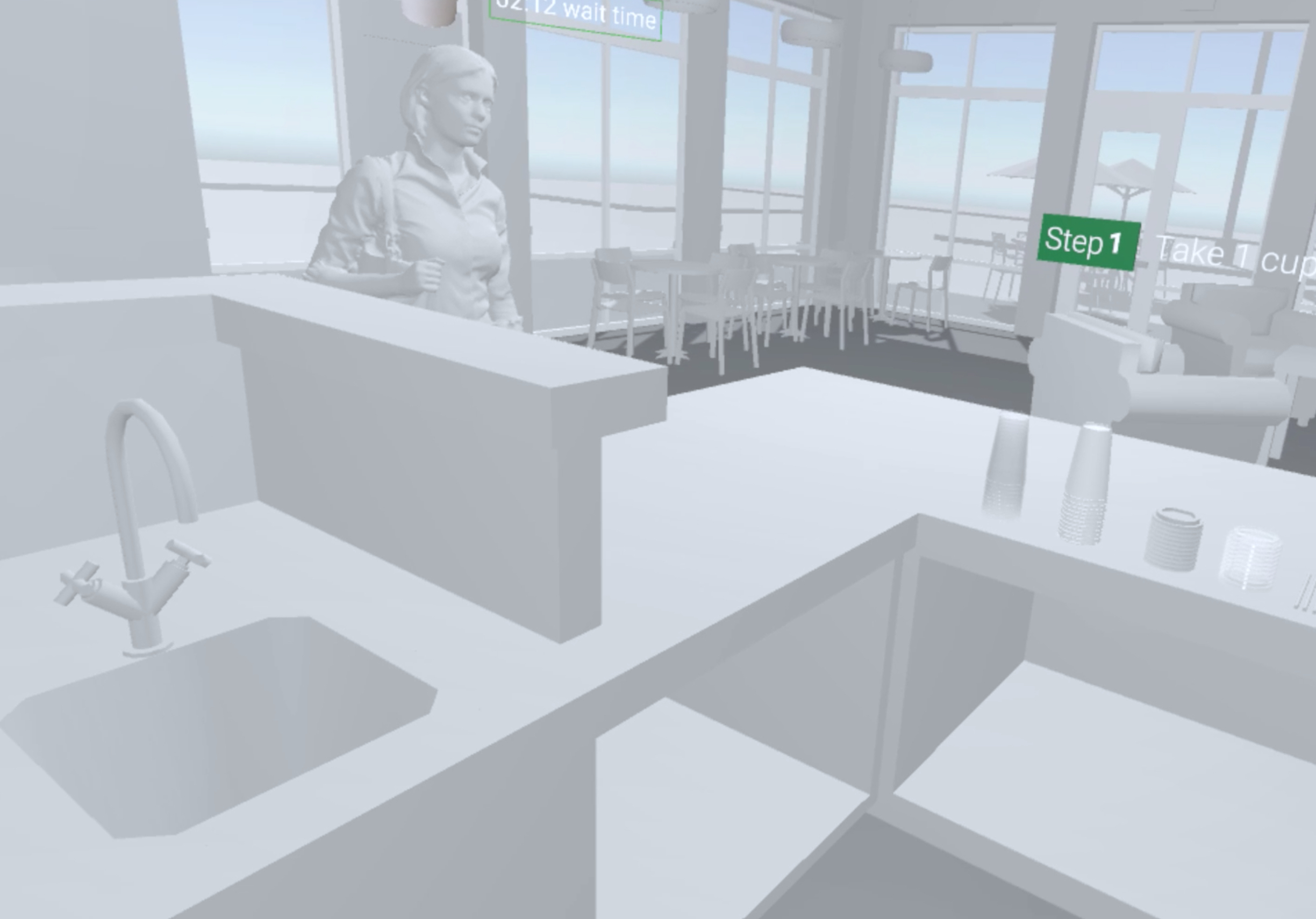
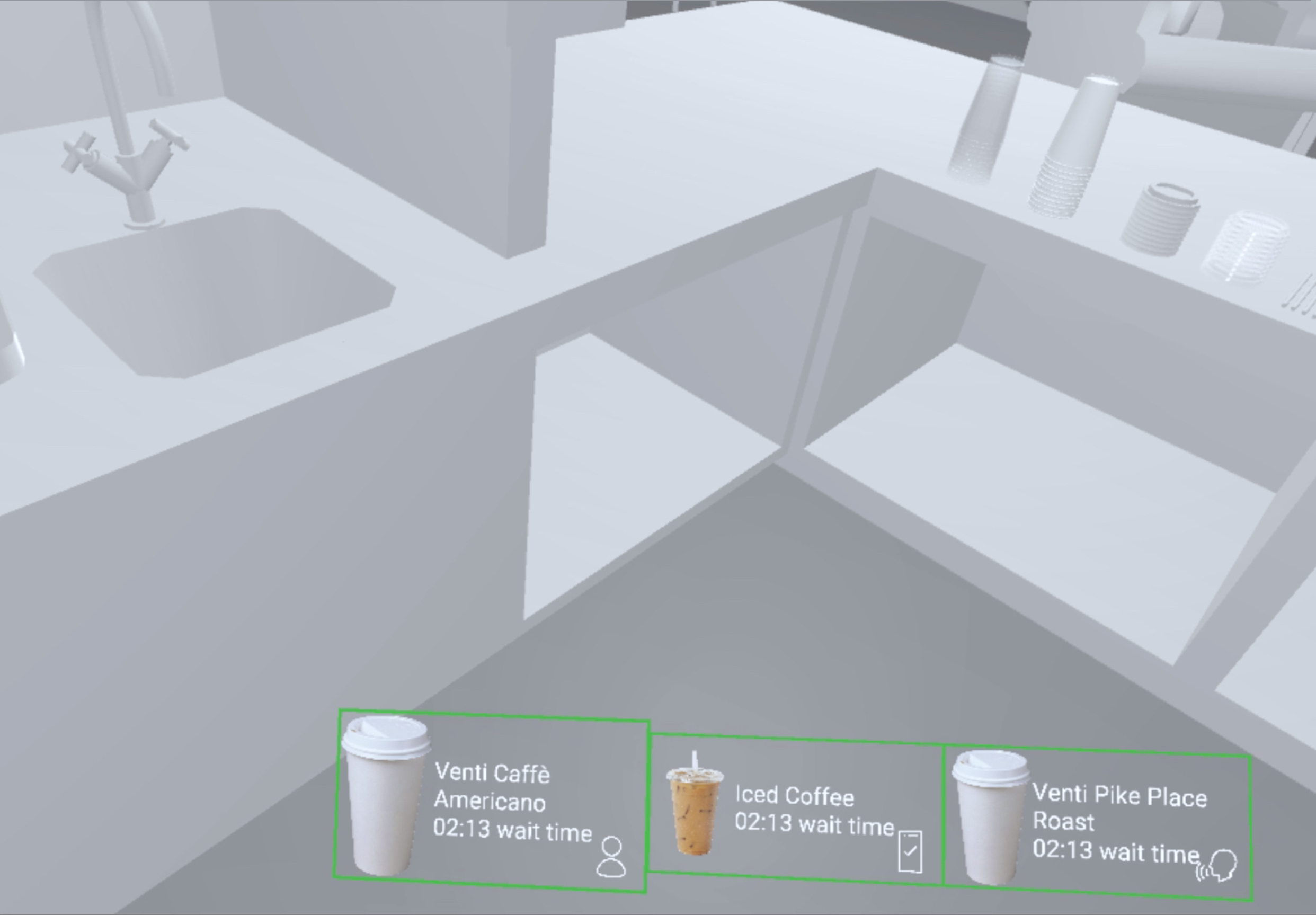
We tested different settings for the position, angle, size of the orders panel. The final design is demonstrated below:
 Usual viewing angle
 Viewing downwards at about 28°